

.svg)
.svg)


.svg)

.svg)
Leez A Space wasn’t just another coworking space—it was built for local service entrepreneurs. Unlike traditional coworking hubs filled with tech startups and remote workers, here, you could walk in and find a beautician, a driving school instructor, a plumber, a CA, or other local business owners—all running their ventures from a professional space.
The Problem? None of this was reflected in the branding.
- The visual identity was outdated, failing to communicate the unique positioning.
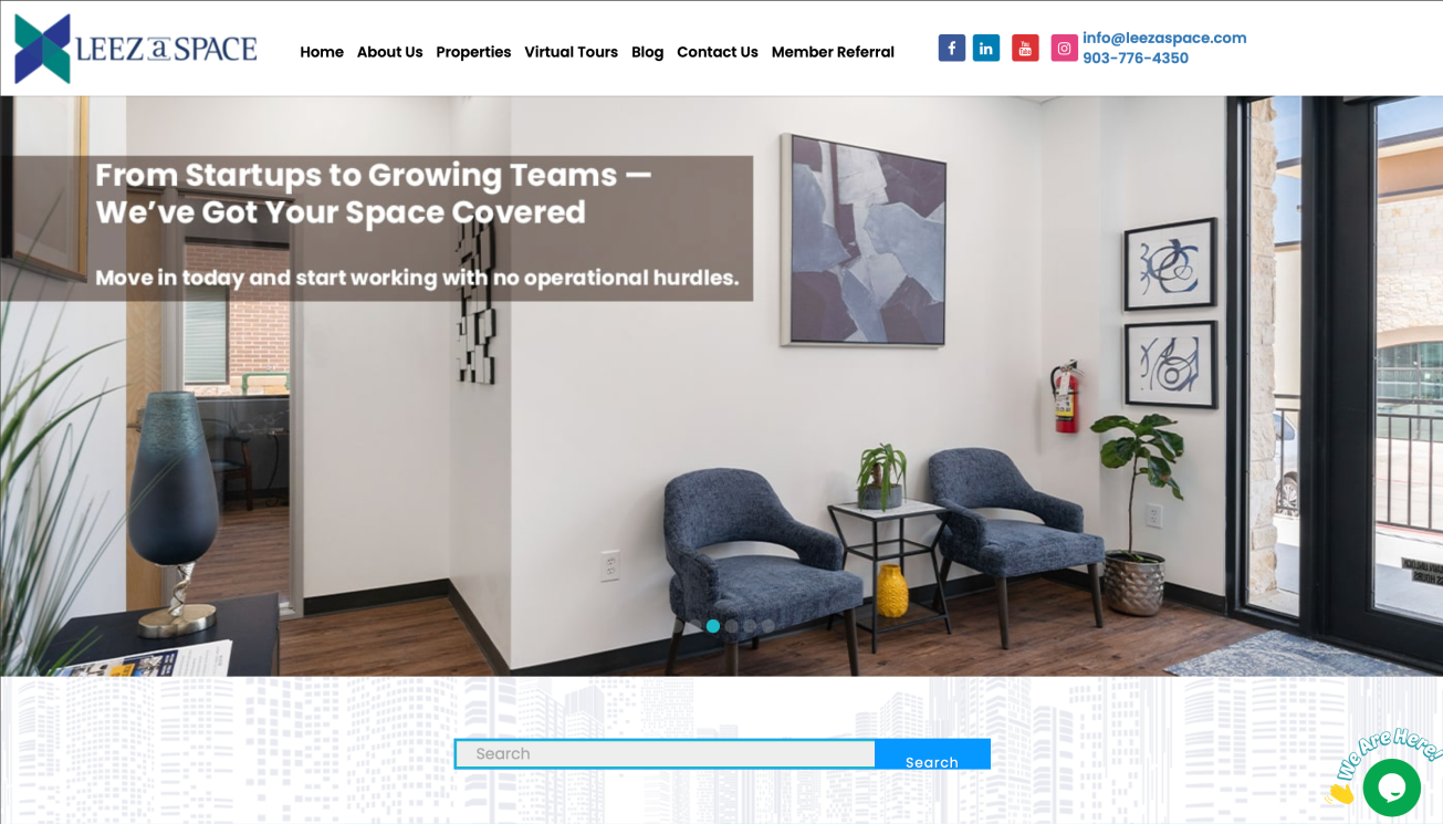
- The name was often mispronounced as “Leeza Space” instead of “Leez A Space,” causing brand confusion.
- The affordability factor—starting at just $750/month, making it highly accessible for solopreneurs—was not clearly highlighted.
Without a strong identity, Leez A Space risked being seen as just another coworking provider, rather than the unique, entrepreneur-first space it truly was.


The Transformation Started with Clarity in Branding and Messaging
- Refined Logo & Visual Identity – We separated “Leez” and “A Space” into two distinct lines, reinforcing correct pronunciation while making the name visually distinct.
- Messaging Realignment – We emphasized that Leez A Space is built for service-based solopreneurs, creating an identity that truly speaks to them.
- Modern Yet Approachable Design – A clean, flexible branding system that highlights affordability, accessibility, and inclusivity for all types of local entrepreneurs.
Now, Leez A Space is positioned as more than just a place to work—it’s a launchpad for local businesses, providing a professional environment without the financial strain of traditional commercial leases.


"With 13 existing locations, the interiors had already established an aesthetic. Rather than forcing a new identity that felt disconnected, we designed a visual system that naturally integrates with the existing spaces—ensuring the brand feels cohesive across every touchpoint."
→ See how our problem-solving approach shaped a brand that fits seamlessly into its own environment in our private case study.
"Leez A Space had a brand name that people misread and mispronounced. By restructuring the logo and name placement, we gave it the clarity it needed—making sure it’s seen and spoken exactly as intended."
→ Full backstory: Private Case Study
.svg)


.svg)